The term “black-and-white photography” is a bit of a misnomer for the medium because, though most images do contain areas of pure white and of pure black, much of the image lies somewhere in the seemingly infinite shades of gray. In this episode of the Monochrome Chronicles, I’ll focus on some of my photographs that feature gray as the predominant influence. These images are somewhat atypical for me in two aspects. First is the absence of people. Most of my work focuses on people as the main subject but not so in these images. I don’t know why, this wasn’t a conscious choice, but it feels right.
The second aspect is the predominance in these images of what is known as “middle gray.” Unlike many aspects of my work, which tends to be influenced by subconscious forces, the trend toward including more middle gray was a conscious choice. Let me explain. The first phase of my photography was during the time I spent in NYC, taking courses at ICP and being influenced by NYC-based photographers. At that time and place, images were predominantly high contrast – meaning that they contained strong elements of white and near-white as well as strong elements of black and near-back, with limited amounts of middle gray. I gravitated strongly to that style of photography.
This trend began to change after I moved to Japan. Despite notable cutting-edge exceptions – such as Daido Moriyama and Eikoh Hosoe – traditional Japanese photographers and mainstream contemporary photographers make more extensive use of middle gray. Their influence stimulated me to re-think my own style and gradually middle gray crept into my pallet. I resisted the trend at first. I remember times in the darkroom when I would say to myself, “Why are you afraid of middle gray? Try it and see.”
I still favor a more high-contrast style in general but the overall impression has mellowed. Let me show some photographs that, though they are atypical for me, feature predominantly middle gray and the full range of grays. This episode of the Monochrome Chronicles follows no formal narrative but will focus on each photograph individually. The main theme is how I perceive the gray scale.
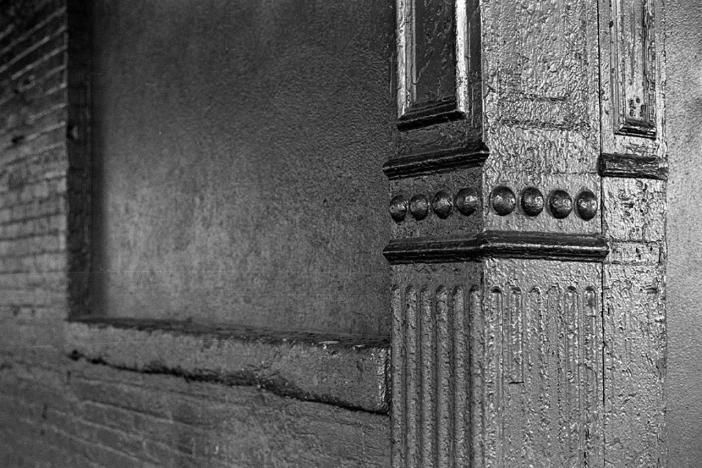
I took this photograph in the early years of my experience in black-and-white photography. Inanimate objects and scenes predominated for me as easier subjects in those days when I was still experimenting with techniques. The Gansevoort had been a mecca for anonymous gay encounters in the 1970-80s, but that period had passed by 1996 when I took this shot. Maybe I was probing the site for old ghosts.
In some ways, the composition is unsettling. Certainly this is not architectural photography nor is it photorealism. My first impression was that this was a soothing but superficial image. Subsequently, though, I began to see deeper elements. Damage and cover-up of old erosion. The light and shadows are unusual. I wonder what attracted me to this scene.
The light, natural light, is the key to this image. The light also reveals the perspective. This building was a relic. It had witnessed several incarnations. It was a survivor.
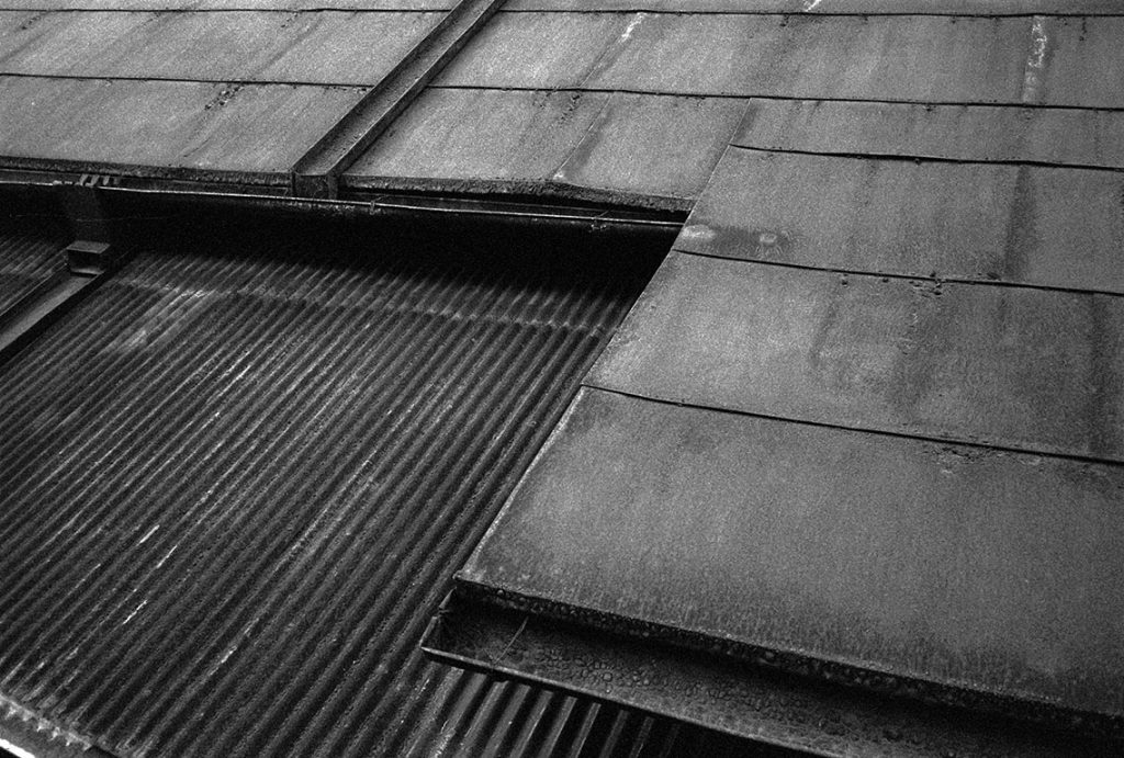
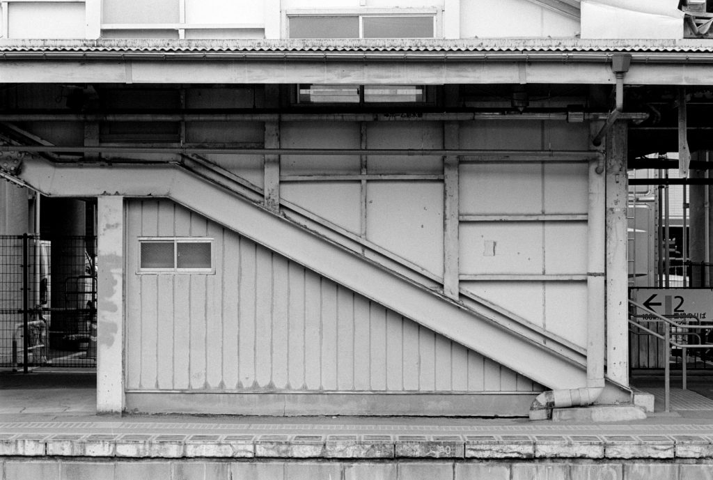
The juxtaposition two strikingly different surfaces is a key to this photograph. It contrasts the smooth flat surface of the original roof with the rough corrugated surface of a post-WWII addition – or possibly repairs. The zig-zag outline of the older roof adds a sense of movement to the image.
The composition, though it is basically geometric, enlivens this image. The two sections of the roof balance, and counterbalance, the composition. Either of them alone might make a statement but the two in apposition make for a lively dialog.
A vaguely interesting roof becomes a strong statement as a result of the playful camera angle that frames this photograph.
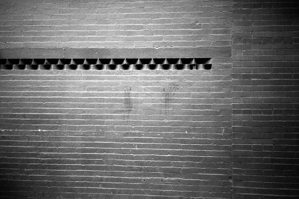
A brick wall also is a challenge for black-and-white photography. It would seem to be a simple thing to do, but it is not. I have often photographed brick walls and very few images turned out well. This image is particularly captivating because of the design element that contrasts with the simplicity, the consistency of the wall itself.
Also, the subtle lighting saves the image from being just a flat surface. Though unintentional, the lighting also focuses attention on the three-dimensional design element.
The seemingly simple composition of this photograph betrays the complexity of the image. Many levels of interpretation are hidden here. Both depth and perspective are evident.
This image uses predominantly the softer range of the gray scale, expressing a more ethereal mood, hardly typical of older neighborhoods in NYC.
A conflict arises here from the use of four distinct segments of the gray scale. The two darker areas – the buildings – try to keep the viewer’s feet on the ground. The two lighter areas invite the imagination. The lightest of the four areas, the vacant billboard, of course, carries my editorial opinion.
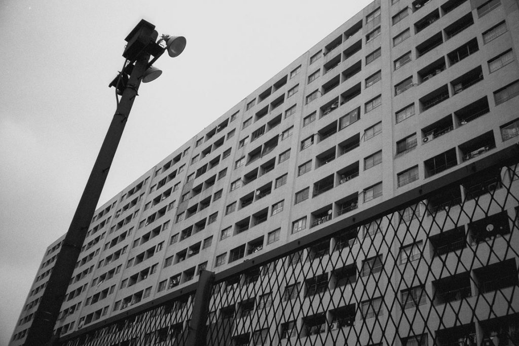
The building probably dates from the 1950-1960s, and marks a transition between old post-WWII reconstruction and modern Tokyo. I would pass by the building occasionally on my afternoon walks. Imagine living in an apartment in such a building. No thank you.
Certainly, the gray scale and intersecting acute angles here reflect my point of view. If you want to believe that these elements prompted me to take the shot, that is your prerogative. If you prefer to think that this was just a spur of the moment quick shot (subconsciously driven), that would be closer to the truth.
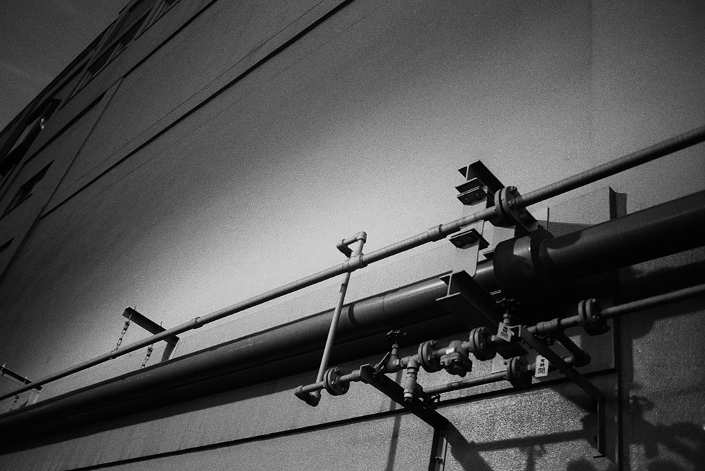
During my walks along this river in the evening after work, the solitude sometimes gave me time to think, to look, to see. Suddenly looming up on one side of the sidewalk would be the back of this building with no windows and a jarring collection of pipes just above eye level. No need to think or to listen for my little inner voice, I just took the shot. Oh, yes, I carry my little point-and-shoot camera every day.
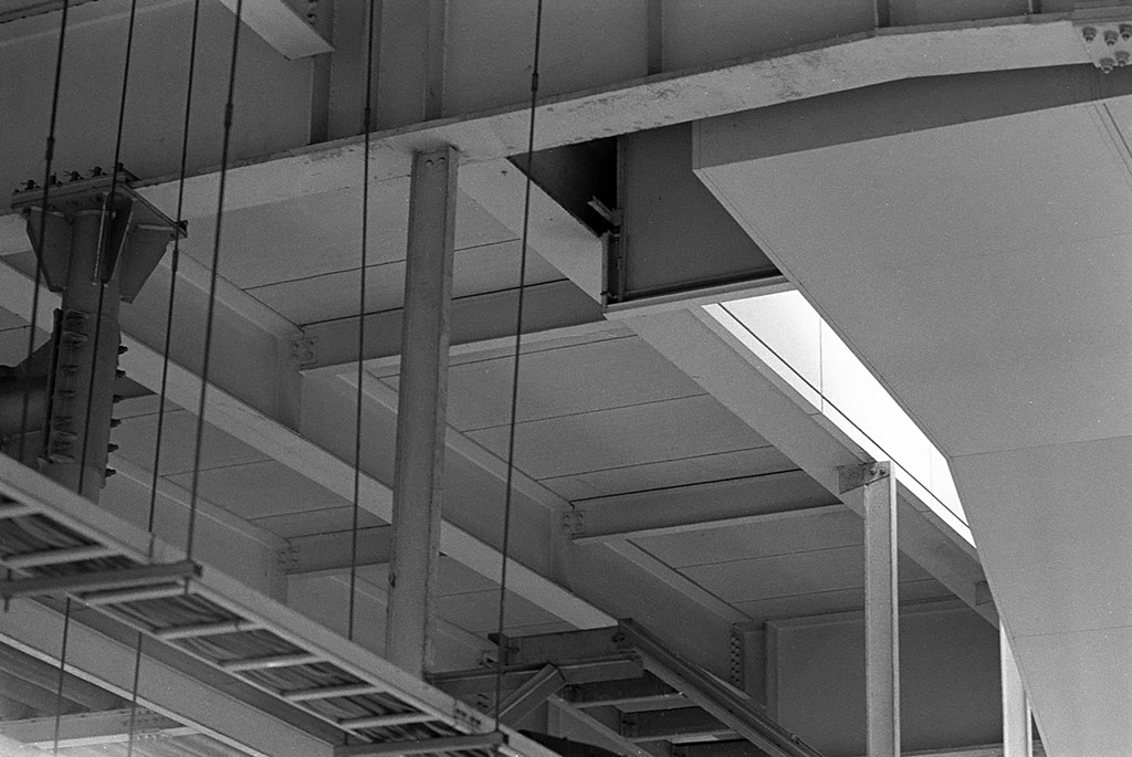
Obviously, this is a man-made structure, but the feeling is somehow ethereal. Hundreds, or maybe thousands, of people walk on the train platform underneath this ceiling every day, but how many of them see what is above? In my photography classes at ICP, we learned the adage, “You have to look before you can see.”
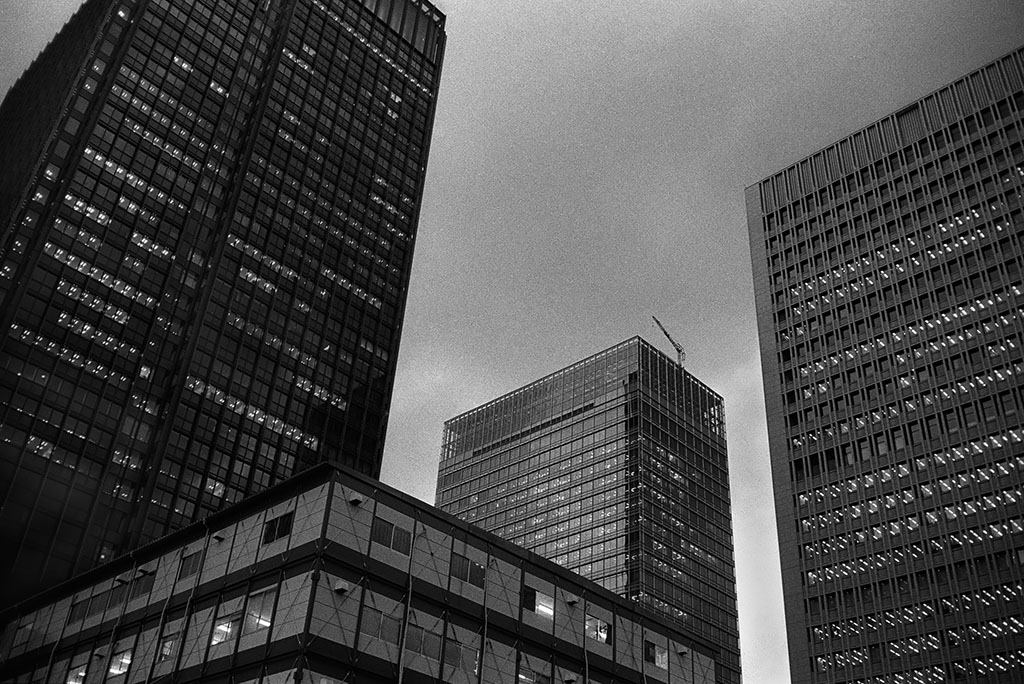
This image from Tokyo Station at dusk is another spur of the moment shot. I had just exited from the station when I noticed the many, many shades of grey in both the buildings and the sky. Click and it was finished. But now it remains. I have it. It will never change.
Such train stations, built I guess in the 1950-60s, exist throughout the prefectures. Their uniformity and the simplicity of their design – from my point of view, anyway – reflect elements of Japanese culture. Even the color, medium gray, is consistent everywhere. Somehow the ubiquitous gray creates a sense of uniformity and stability.
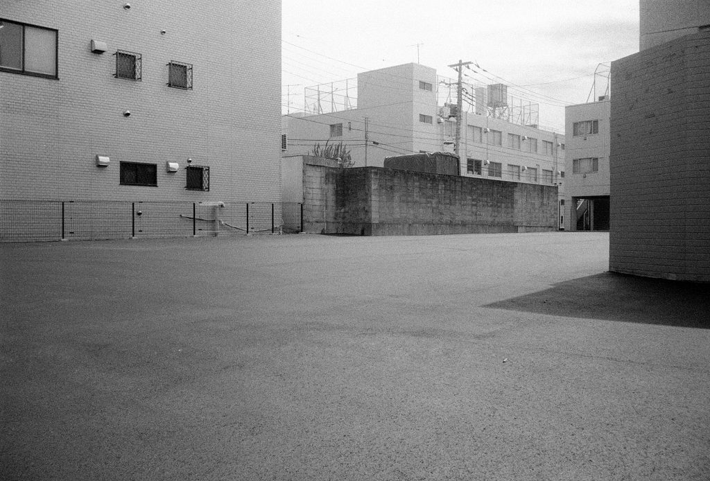
The uniformly gray exteriors are evident in this image. Whether this is a valid cause of criticism is debatable. Certainly the gray pallet in this photograph is soothing. The lot and the buildings are strikingly clean. The absence of people and cars – well, that is hardly characteristic of busy crowded Tokyo.
On the other hand, I can take the photographer’s prerogative. Whether this scene is characteristic of Tokyo is beside the point. The image, with its predominantly gray scale, speaks to me and that is the point, my point of view.
Maybe this image illustrates the influence of Japanese aesthetics on my photography. American photographers, me included, tend to fill the entire frame with the subject. In fact, a pundit once quipped, “If your photos are boring, you are not filling the frame with the subject.” Says who? Japanese photographers, in contrast, incorporate abundant open space in their composition. Doing so allows the viewers the freedom to use their own imagination.
At the risk of being redundant, let me say again that the photographs in this episode of the Monochrome Chronicles are hardly typical for me. My key message is that the gray scale varies widely, seemingly infantesimally, between pure black and pure white. With time and the transition from NYC to Tokyo, I’ve become much more comfortable in the gray zones, sometimes to the extent that all, or most, of an image resides there.